Acerca de

Role: UX Designer
Duration: 2 months
Project overview
Brief
Charvick Farm is a family-owned, small business that specializes in selling ethically harvested wood products and unique rustic items. It is looking to start a responsive e-commerce website that meets the customers' needs. As the sole UX Designer, I managed this project from inception to final design through research, ideation, and UX design principles.
Project
Design an accessible and responsive e-commerce website that allows customers to securely browse and purchase products directly from Charvick Farm.
Problem
Charvick Farm has no online presence, which makes it difficult for customers to purchase their products without going to the farm in person.
Solution
Design an e-commerce website that allows customers to easily and securely browse and purchase products directly from Charvick Farm.


Understanding the user
User research
I conducted exploratory research on the common pain points of shopping online. Then, after crafting questions from those research findings, I interviewed people to truly understand the needs, behaviors, and motivations of the users. I used this qualitative and quantitative data to create personas that reflected users.


Feedback


Personas
Problem statement:
Michelle is a Radiology Technologist who needs to pay with Apple Pay when shopping online because she wants a speedy checkout process while still knowing her payment information is secure.


Problem statement:
Nancy is a passionate biologist who needs to easily and securely purchase products on her mobile phone because she does not have time to sit at the computer and wants to feel confident in the purchases that she makes.
Pain points


Understanding the business
Business goals
After analyzing the user research, I sat down with the executives of Charvick Farm to talk about their business goals and what they wanted to achieve through Charvick Farm. I wanted to make sure that the website not only reflected the desires of the users but also helped Charvick Farm achieve its goals.


Crafting the brand
Brainstorming
After addressing business goals, we began brainstorming about the Charvick Farm brand since the current brand identity was minimum. I wanted to ensure the website retained the values and meaning that Charvick Farm held in the hearts and minds of the founders. I asked them to list any words, phrases, or colors that they associated with Charvick Farm. Then, I asked them to come up with 5 to 6 keywords that they felt embodied the company. I used this information as the design inspiration moving forward.


Choosing the colors
I combined the color preferences provided to me by the executives with color psychology to select the best colors for the Charvick Farm brand and website. I incorporated many natural and earthy colors that users would expect from a farm. I also included many neutral colors that resembled the colors found in wood since wood products are one of their main offerings.
Color combinations were also evaluated to ensure that they met the WCAG 2.0 guidelines for accessibility.


Designing the logo
We utilized Crazy 8’s to ideate logos. Through this activity, we decided that the iconic Charvick Farm sign should be the logo for the company and I set to work digitalizing the sign.

Starting the design
User journey map
I mapped out the user flow to gain an understanding of the steps a user would take to arrive at their end goal. This also helped to identify what screens to include in the design.

Site map

Afterward, I created a sitemap and organized the information in a way that would be most intuitive to users and promote business goals.
Paper wireframes
I put pen to paper and began to design some wireframes. I made various iterations of the desktop version of the homepage to determine which layout that would best suit users at the beginning of their user journey. Then, I sketched the main user flow of finding and purchasing an item. I also included a few variations of the ‘Cart’ screen.


Digital wireframes
I reviewed these designs with Charvick Farm executives, and we discussed which iterations and features they liked best. Noting which features to move forward with, I transferred these paper wireframes to digital wireframes. I included both desktop and mobile versions to ensure the designs were responsive to a variety of screen sizes.
Sorting feature to make shopping more efficient


Lots of space for product information that is located front and center


Quick checkout process with lots of payment options and breadcrumbs to encourage and inform the user


Easily navigable online store for customers to shop all of Charvick Farm's products


Adding details
Prototyping
I merged the branding into the designs and created a high fidelity prototype of the shopping flow on both desktop and mobile.


Voice and tone
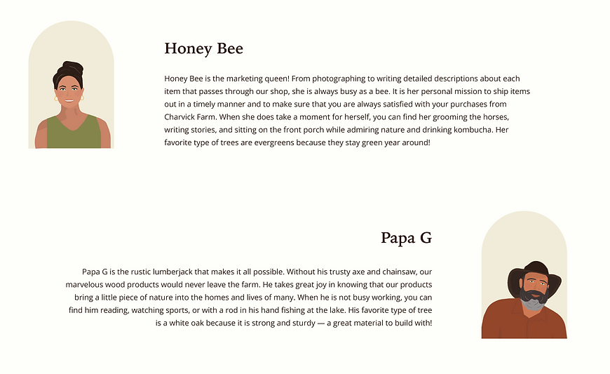
Apart from designing the microcopy, I created additional content to enhance the user experience with Charvick Farm and to provide a family-owned, small-business feel. I used title case throughout the designs to give it an old-fashioned flair while using word choice and flow to reflect the fun and relaxed style of the brand. I also emphasized their concern and love for sustainability and transparency. Lastly, I highlighted the family members who help run the business to encourage a welcoming and “at home” feel for users.

Testing the design
Usability testing
Usability testing was one of the most important parts of my design process. I conducted usability testing with users had varying degrees of technical expertise and at least some experience with online shopping. This study offered insights into the parts of the design that were unclear or difficult for the user.


Insights


Refining the design
Usability changes
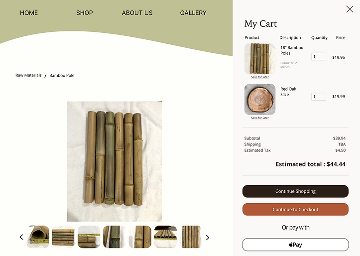

The cart was changed to be an overlay instead of having its own separate page to allow users to easily view it without leaving the current page. Also, a 'Save for later' button was added to the cart area to provide users with more flexibility when shopping.


Wording was made clearer to prevent confusion during the checkout process. Some of the changes included changing 'Shipping' to 'Shipping Details' and changing 'Billing' to 'Billing Address'.
Finalizing the design
Mockups
After incorporating the insights from the usability study, I finalized the mockups. I used photos of Charvick Farm’s products to ensure that the website design complemented the products too.


Next steps
-
Conducting additional research and studying metrics to see if any areas of the user experience need iteration
-
Adding additional content and graphics to enhance the user experience while emphasizing sustainability and the family-owned, small business aspect
Conclusion
Results


Takeaways
As an environmentalist, I am thrilled to know that the results of this project will not only benefit the customers of Charvick Farm but will also promote sustainability efforts. While designing this website, I wanted to communicate the importance of user-centered and responsive design while incorporating both the needs of users and business goals. This project taught me a lot about collaborating with executives, project management, and combining business goals with the needs and desires of users. I look forward to using this knowledge and experience in future projects.